


#67 LW
Search results
Arizona Coyotes
Apr 17, Final 49-27-6Oilers2-5Mullett Arena
 36-41-5Coyotes
1 2 3 1 0 1 1 1 3 T 2 5 Final EDM ARI Other games
Metropolitan GP W L OTL Pts  NY Rangers
82 55 23 4 114  Carolina
82 52 23 7 111  NY Islanders
82 39 27 16 94  Washington
82 40 31 11 91  Pittsburgh
82 38 32 12 88  Philadelphia
82 38 33 11 87  New Jersey
82 38 39 5 81  Columbus
82 27 43 12 66 Arizona Coyotes Logo on Chris Creamer's Sports Logos Page - SportsLogos.Net. A virtual museum of sports logos, uniforms and historical items. Currently over 10,000 on display for your viewing pleasure.
- Phoenix Coyotes Playing Surface
Phoenix Coyotes Playing Surface Logo on Chris Creamer's...
- Phoenix Coyotes Dark Uniform
The Winnipeg Jets move to the Desert to become the Phoenix...
- Phoenix Coyotes Alternate Uniform
Phoenix Coyotes Alternate Logo on Chris Creamer's Sports...
- Phoenix Coyotes Light Uniform
The Winnipeg Jets move to the Desert to become the Phoenix...
- Winnipeg Jets
The logo, uniform, and branding history of the Winnipeg Jets...
- Primary Logo
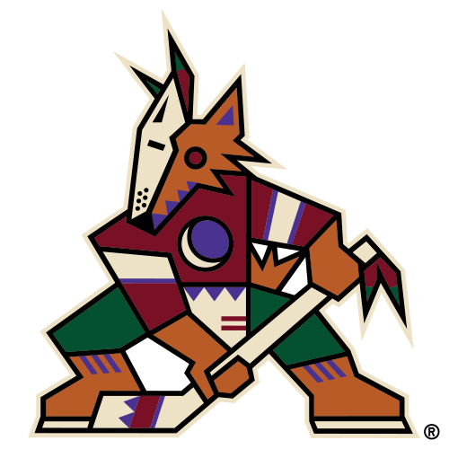
What is the Arizona Coyotes Logo? The Kachina logo returns...
- Phoenix Coyotes Playing Surface
- The Kachina Coyote
- The Peyote Coyote
- Coyotes Classic Logos Are Unmistakably ’90s and Loved by Fans
- The Howling Coyote
- The Running Coyote
- Then Came The 2015-16 “Rebrand”
- Coyotes Kachinas Remain Iconic
Everything that’s old is new again. One of the most polarizing logos and sweaters in NHL history first appeared when the Phoenix Coyotes began play in 1996-97 after relocating from Winnipeg, and after ditching them for the Howling Coyote (see below) in the early 2000s, the now-Arizona Coyotes have gone back to their roots. The Kachina Coyote was ag...
Building on the wonderful weirdness of the original logo combination, the Coyotes introduced an alternate logo and uniform for the 1998-99 season, featuring a close-up of the Coyote’s head as the primary crest. Set against a deep green backdrop bordered by a desert landscape (including the crescent Moon rising over it all), this logo (and jersey) w...
The Coyotes’ original logos of the 1990s were original, creative, and unapologetically Southwest, and they still stand up well today. There’s a reason why the franchise returned to the look prior to the 2021-22 season – they’re classics, they’re instantly recognizable throughout the league, and Arizonans still want to wear them and see them out on ...
After sharing a basketball-specific arena with the NBA’s Phoenix Suns for the first seven and a half years of their existence, the Coyotes moved into their own place in Glendale in 2003, and the club took the opportunity provided by a new building to also rebrand with a new logo, color scheme, and uniforms. Gone were the classic Kachinas of the 199...
Nearly 10 years after the unveiling of the Peyote Coyote, the Coyotes tried their hand at alternate jerseys once again in 2008. This time, they went in the opposite direction. In the ’90s, the franchise simply took the head from the original Kachina Coyote logo, enlarged it, and slapped it on the front of a jersey. In 2008, though, they already had...
Though the Howling Coyote remained the team’s primary logo after a 2015-16 “rebrand,” there were a few changes to the uniform that made them pop a little more. The team did a much better job featuring the secondary color of black in both the home and road uniforms. From 2003 to 2015, the home jerseys consisted of red jerseys with white trim, while ...
Throughout their history, the Coyotes have used many primary, secondary, and alternate uniforms and logos, but the best of the bunch, was, undoubtedly, the first iteration, and that’s ultimately why they returned. The Kachina is an iconic image within Arizona, and it’s quite a polarizing topic outside of the state. The original (and current) jersey...
Sep 20, 2021 · The crescent moon on its chest creates a "C" for Coyotes; the position of the Kachina is meant to evoke an "A" for Arizona. The logo was voted the greatest in Arizona sports history in a...
- Greg Wyshynski
May 1, 2020 · May 01, 2020. Little known fact: The original Coyotes logo was birthed from a collection of dolls. The logo, recently voted as the greatest in Valley sports history. by the Arizona Republic.
2021–2024. After using the katchina logo as a secondary logo for three years, on September 20, 2021, the Coyotes announced that the logo would return full-time as a primary logo beginning with the 2021-22 season. As a result, their previous logo from 2003 gets demoted to secondary status.
Nov 21, 2023 · In 2020, a reader poll in the Arizona Republic deemed the Arizona Coyotes “Kachina” logo the greatest in Arizona sports history. First introduced in 1996 when the team relocated from Winnipeg, the logo is based on the ancestral spirits of the Pueblo people and depicts a coyote holding a hockey stick.
People also ask
Where can I find the Arizona Coyotes primary logo?
Does Arizona Coyotes have a kachina logo?
Are Arizona Coyotes rebranding?
What happened to the Arizona Coyotes logo?


